BamCayetano

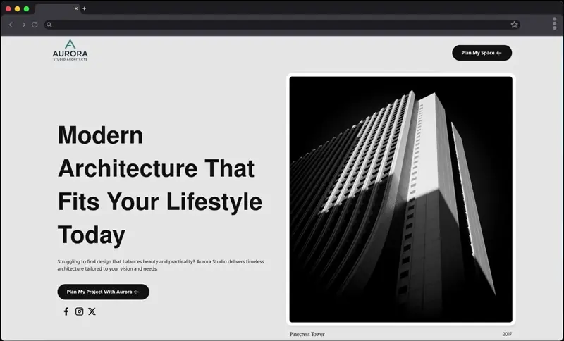
This project was a personal design exploration for Aurora Studio, an architecture firm concept. The goal was to create a sleek, modern website that reflects trust, precision, and human-centered design while showcasing services and past projects in a clean, engaging way.
The Challenge
Aurora Studio needed a website concept that would:
• Reflect modern, sustainable, and people-focused architecture
• Differentiate from generic template-style architecture websites
• Present services, values, and testimonials in a structured but engaging format
• Communicate professionalism and credibility with minimal yet striking visuals
The Approach
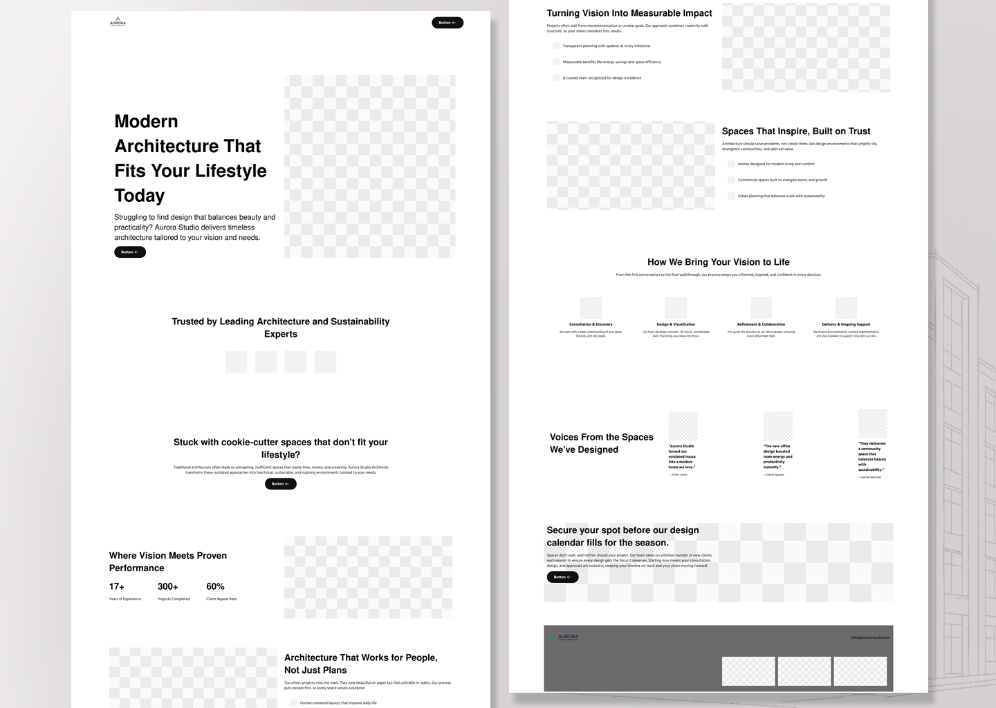
Wireframing & Layout
• Designed a streamlined layout with clear sections: hero, trust indicators, services, case studies, process, and testimonials.
Branding & Visuals
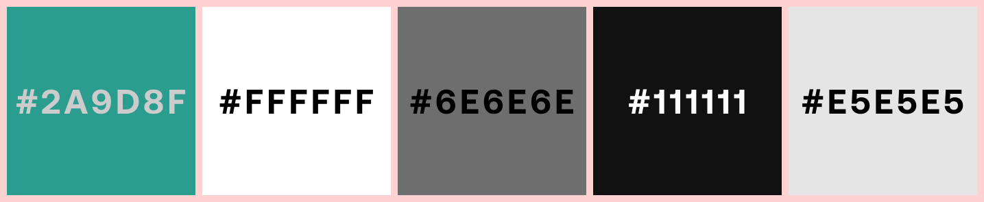
• Built a clean, minimalist color palette using teal, white, dark gray, and neutral tones to balance creativity with professionalism.
TypographyCopywriting
• Used bold, geometric sans-serif fonts for headings paired with clean body text for readability.
Content Strategy
• Focused on concise messaging such as “Architecture That Works for People, Not Just Plans” to highlight client-focused design.
Conversion Flow
• Added consistent CTAs like “Plan My Project With Aurora” to encourage inquiries.
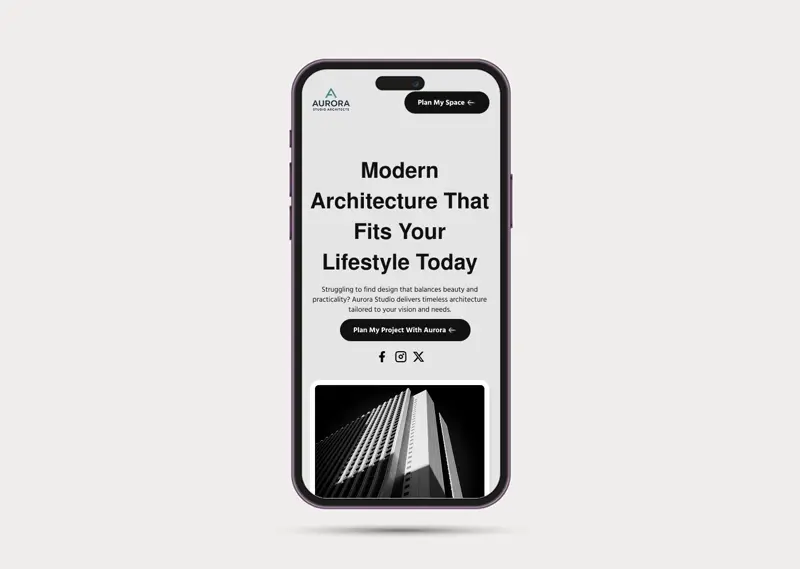
Mobile-first Design
• Optimized buttons, spacing, and text for quick readability and tap-friendly navigation.
Final Outcome
The final design delivered:
• A modern, minimalist website concept that showcases architecture services clearly
• Strong trust-building elements with partner logos and testimonials
• Step-by-step breakdown of the design process for client transparency
• Responsive layouts for both desktop and mobile
Reflection
This was a passion project that pushed creative exploration in the architecture niche. It was an opportunity to refine skills in minimal design systems, brand-driven layouts, and creating a digital presence that feels as timeless and intentional as the spaces it represents.
Tools Used: